Choosing a grout colour shouldn’t be as simple as black or white, nor should it be a choice left completley up to the tiler (though, they often do have amazing advice!)! There is no right or wrong answer when it comes to choosing grout. It all depends on the look you are after; if you choose a grout colour that matches the tile, you will create a seamless blend, whereas with a contrasting grout colour you can create a more eye-catching.


Contrasting Grout
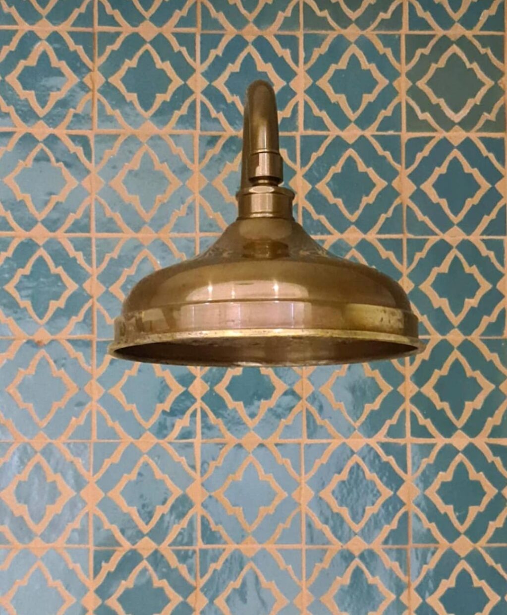
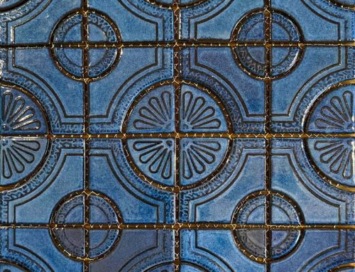
Contrast is your best friend if you are after a look that stands out and draws the eye. Selecting a grout colour that contrasts with the colour of the tile will create a more defined look and reveals the shape of the tile more clearly, creating a pattern from the negative space. It is an excellent option for tiles with unique shapes, as the grout makes the tile shape more of a feature. Another thing to consider when choosing a contrasting grout colour is that the contrasts emphasise variations within the tile more clearly and can be overwhelming in larger spaces.


Matching Grout
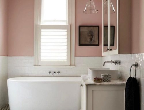
By choosing a colour similar to that of your tile, you are creating a seamless, modern and minimalistic look, as there are no harsh lines between tiles; this style is also effective in making your space appear larger.
Complimentary Grout
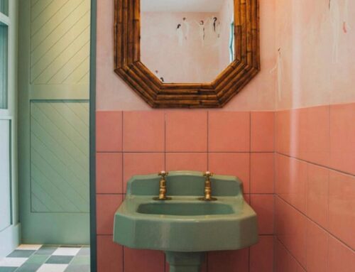
For a complimentary look, we suggest a grout colour that matches the edge of the tile, creating a balanced look. When choosing grout for a patterned tile, either stick to the edge colour or choose a colour from within, ensuring that the same theme of the tile is maintained throughout. After a look that highlights the tile pattern? Choose a colour that matches the tone but is a few shades darker to emphasise that pattern subtly.


Colourful Grout
If you are more daring, why not try a colourful grout? Colourful grout can make a strong statement and add personality to a space. It works best when colour is based on a hue found within the space and isn’t pulled out of thin air.
PSA: Grout is much harder to change, so make sure you love the colour before committing!
Industry Tips
Avoid white on the floor; it is a great colour and our go-to for wall tiles. However, shiny white won’t stay shiny forever in such high-traffic areas.
If unsure, always choose the lighter shade, as it is more likely to compliment the design.
If you have any further questions, contact us HERE!


Leave A Comment