At Jatana Interiors we try not use the word “Trend” all too often… we instead prefer to focus on the terms classic, timeless, and unique. That said there is a time and place to talk about all things colour trends and forecasting, especially as we near the beginning of a new year!
It’s no secret that we love colour and the Jatana Tile Range is a testament to this, whilst we aren’t followers of any exact trends we are of course influenced by the ebbs and flows of tones within the interior design world and of course within nature.


Colour has the intrinsic ability to define your relationship with your home; a space more so now than ever for work, play, and relaxation. For the year ahead the emerging colour trends encourage a home where we can relax, recharge, and feel comfortable. These palettes are predominated with lots of tranquil colour hues from warm and rustic tones to serene blues and greys that create a calm interior base that is easily built upon. However, there is also a feature trend for brighter tones that add a little more colour and cheerfulness to our lives, now this is something we absolutely embrace!
We’ve rounded up all you need to know about the key colour palettes for 2021 and added some serious tile inspo into the mix to get your creative mind working!


WARM AND RUSTIC COLOURS
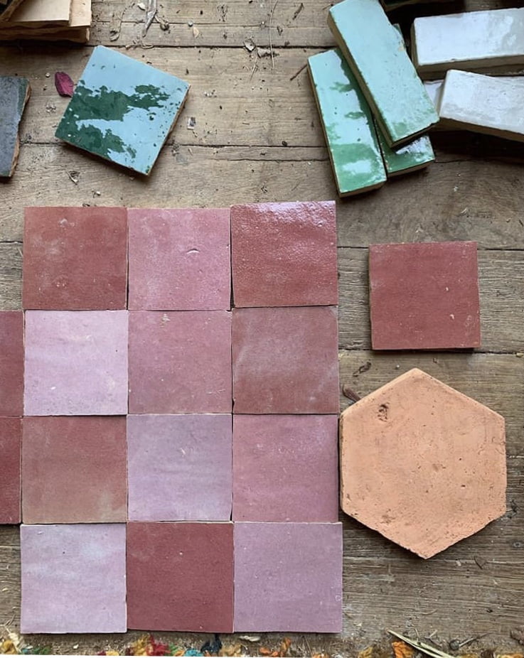
Colours from all over the world are represented in this palette, and for this reason, it is one of our favourites and most referenced. From golden pink shades of Moroccan desert sand to burnt orange shades with Mexican references, the earth’s own colours create associations with landscapes and cultures around the world. Clay and rock, sand, and soil. The materials that make up both houses and cities are essential building blocks, also in our lives. Red and brown, muted yellow and rustic terracotta. These are earth tones that have a unifying effect and we are longing to fill our interiors with their comforting embrace and sense of grounded connection. This is a palette for creatives, adventurers, and lovers of true craftsmanship. Think Terracotta or Antique Encaustic Tiles emblazoned with a splash of rich pigment.


SOFT NEUTRAL COLORS
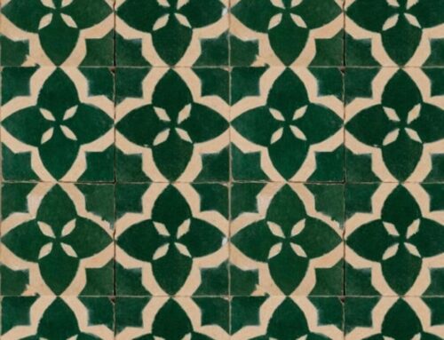
Neutral colour tones have been reigning supreme within the interiors landscape over the past few years and all for very good reason, from paint colour to tiles it’s all about the perfect combination of neutral color tones! Neutrals have a distinct ability to create a harmonious atmosphere within an interior, these colors do not demand attention but envelop us in their brightness and soft, soothing appearance, and for this reason, neutral tiles can make a wonderful addition to any bathroom or kitchen space. This palette of warm and timeless hues strikes a perfect balance between understated beauty and minimalism. Neutral shades can be used to create a monochrome style or combined with bolder tones for exciting contrasts. Think Reproduction and Moroccan Tiles.


AIRY BLUE TONES
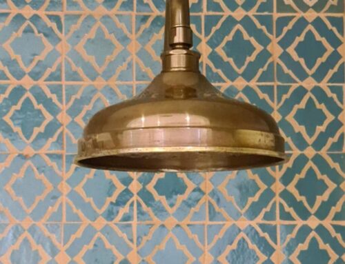
In an everyday life with constant distraction, beautiful botanicals, greens, and grays can create an experience of timelessness and tranquility. This is a palette for those of us who want to be more present in the now and seize the moment! These tones inspire a cozy and harmonious interior aesthetic and encourage an inviting space to recharge and take stock. This is a tile palette that works perfectly in bathrooms as it enhances the need for reflection at the beginning and end of each day. From spectacular, beautiful beaches to rugged bush simplicity, the colors in this palette are inspired by the contrasts of nature and provide a new feeling of fresh joy for all of the senses. The Grey-blue hues of the sea, the white foam peaks of the waves, and gray-cut boulders – these are colors that characterise the Australian coastal landscape. Places we like to visit when we need to embrace quiet and steady tranquility… it really does make perfect sense to invite this palette into our homes! Think Moroccan, Reproduction and Antique Encaustic Tiles.


Leave A Comment